Wednesday, December 14, 2016

Long Beach Museum

                               
Tony Berlant
Untitled, 1989
Silkscreen on aluminum, edition 77/250

I've lived in Long Beach, California my entire life and not once have I ever been to the Long Beach Museum of Art, so I decided to check it out for my project. Unfortunately the silkscreen options were scare during my visit but I was able to find some. These two pieces were done by an artist named Tony Berlant. Berlant is an American artist from New York City but attended school at the University of California in Los Angeles. He received a BA and MA in painting and an MFA in sculpture. Berlant became known for his collages of found metal objects. These two silkscreen pieces displayed in Long Beach are actually printed on aluminum. The detail and color scheme he chose would never make you believe they were sitting on thin sheets of metal. Seeing his art came at a perfect timing as we wrapped up the semester by opening the door to creativity to print on new objects. I love the beach like vibe of the palm trees, colors and beach babe presented through his technique. This was definitely an inspiring experience to be more optimistic when printing art in the future!

RH Quaytman at MOCA


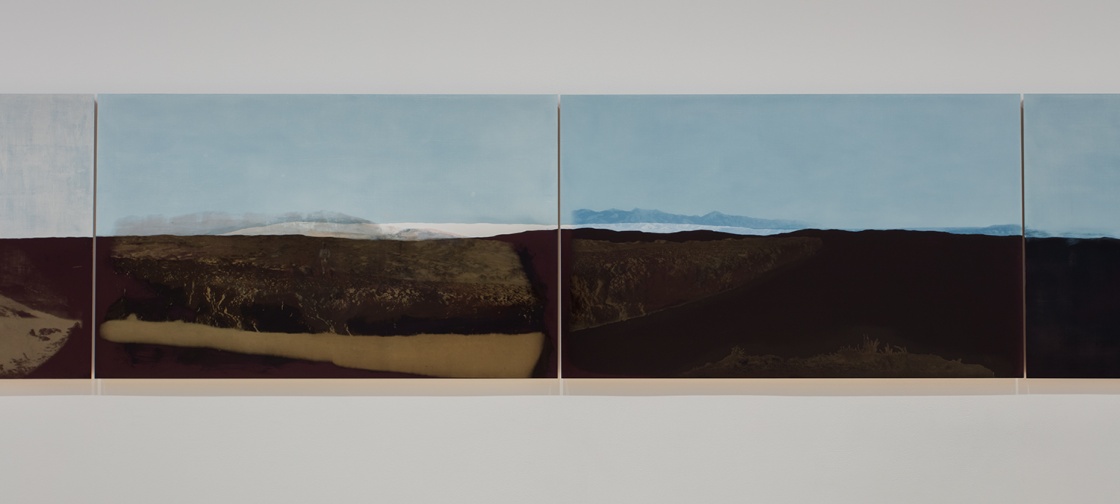
I went to see the RH Quaytman show at the Museum of Contemporary Art in LA. RH Quaytman is an artist from Boston whose career began in the nineties. She is known for combining oil painting and silk screen. She makes conceptually linked works that make up 'chapters'; the exhibit I went to was called 'Chapter 30: Morning'. Usually her work is site specific, and incorporates features of the venue in the work. Each piece is printed and painted onto a wood block, and many of them seem to explore landscapes and texture. There were some that included more obvious 'photo' layers like in her earlier work, but there were a lot of these color field landscapes. These seem to be a departure from earlier, more figurative work, but they have the same ambient characteristics. (I included some of her earlier work at the end of this blog post because it's so amazing.) The picture above is just two images of many that are arranged next to each other across a whole wall of the exhibit.
The silkscreen layers seem to me to be photo emulsion. They have the quality of something being distorted through xerox with the texture you would find looking at something under a microscope. This piece in particular almost looks like a diagram of the different layers of soil. 
With the knowledge that all of her work is site specific, I wonder if it's an abstract study of a desert in California. (She lives in New York.) Her work is what we would call an example of 'experimental forms' because it combines oil painting and silkscreen. I think it's so interesting to see artists use a method like this without creating an edition. The quality of the silkscreen layers makes the paintings, for me.

I love RH Quaytman and I was super excited to see some of her paintings. This show will be at MOCA on Grand Ave until February 6th if anyone is interested in seeing it. 

Some of her earlier work:


-Scarlet Sidwell

Alfredo Manzo Cedeño Homage to Warhol at Molaa


 For my post I decided to check out what Molaa had to offer. The museum has several interesting prints from a variety of different artist. The one piece that caught my eye the most was Alfredo Manzo's piece entitled The Cuba's Soup, Homage to Warhol. It was really interesting to see Manzo's take such an iconic work of art and make it his own. The prints is are serigraphs about 22 x 14.5 in. (55.9 x 36.8 cm.) and it is each are from an edition of ten. The pieces have vibrant eye catching colors mainly red and yellow.Once you look closely at the work you begin to realize all the little details the artist infused into the prints. The famous Campbell soup can has been altered and reads "Cuba's condensed Migration Soup". Each print delivers a different message. The ones i saw were labeled Ideology, Revolution, Migration, and History. Each print seems to represent a different stage of Cuban history. From Che Guevara to Fidel Castro and even Elian Gonzales, who  became embroiled in a heated international custody and immigration controversy involving the governments of Cuba and the United States. The prints reference people who in some way had a great impact on the island and its culture.

Born in Havana in 1964, he studied at the Academia San Alejandro to become a teacher. He is interested in printmaking and painting. In his work Manzo has always questioned the artificial division between "high" and "low" art, a philosophical theme that is clearly apparent in his Cuba's Soup series of serigraphs shown here — they are not just an homage to Warhol, but also a satirical commentary on the state of relations between Cuba and the U.S.


My visit to Molaa was eye opening and interesting, it has a good selection of works considering how small the museum actually is. Admission is free every Sunday and the exhibits are constantly changing so there is always something new to discover.


I attended LACMA's The Serial Impulse At Gemini G.E.L. which presented a selection of notable projects from the renowned Los Angeles print workshop Gemini G.E.L.


Gemini G.E.L. is an artists' workshop and publisher of limited prints located in Los Angeles. Founded in 1965 by master printer Ken Tyler, the workshop has collaborated with many artists of the years.
Among the projects Michael Heizer's Scrap Metal Dry Print stood out to me.


“We are a piecemeal society. We make big things out of little things. Our buildings are millions of fragments stuck together.”—Heizer, 1983


Heizer used salvaged waste aluminum and zinc from the California aeronautical industry. He cut discs from sheets with evidence of physical signs of wear and tear from scratches and scrapes. The disc sizes were calculated  according to a geometric theorem that dictated equivalence between surface area of a circle and four proportionally smaller circles. The combined surface area of the smaller segments equals that of the surface area of the large circle. After arranging the parts to illustrate the theorem in six permutations he inked the plates and used a high pressure hydraulic newspaper press.
Within the pieces one can see "a pulse" of lunar landscapes, microscopic colonies, or intersections of crystals formed by the worn surface area of the sheet metal.


Thanks for a great semester!

Tuesday, December 13, 2016

Pomona College Museum of Art

I visited the Pomona College Museum of Art and found a few interesting prints. Their collection of prints were comprised of lithography, etchings, drypoint, and woodcuts.
This first print is titled "The Moth,"and was created by C.M. Pomerat using drypoint on paper. The dimensions are 6 in x 4 which exemplifies the technical ability and craftsmanship of the artist. Pomerat utilized fine detail in the darker areas and then spaces out the details to create the illusion of light.

"Library," is part of a series of lithographs done by Edward Ruscha in 1993. Ruscha was involved in the Pop Art scene in the early 60s.  He had an admiration for Abstract Expressionism and utilizes a wide range of media on his other works of art; however, his later work was inspired by darker themes.  This particular piece stands out as a result of the barren library that seems to be isolated in the middle of nowhere.
This piece is titled, "The Custody of a Criminal Does Not Call for Torture." It was completed by Francisco de Goya in 1859 using a combination of etching and drypoint on paper. The dimensions of this print are 4 1/2 x 3 3/8. This is one of his later pieces which explored social justice and challenged the morality of the human soul. Goya did not explore the darker elements of life until he was struck deaf by illness.

Jasper Johns at Serial Impulse GEMINI G.E.L @ LACMA

Recently, I went to the Los Angeles County Museum of Modern Art aka LACMA to check out the Gulliermo Del Toro Exhibit "At Home with Monsters". While at LACMA, I stopped by the Resnick Pavilion to see The Serial Impulse at Gemini G.E.L. exhibit. When I walked in the space I was immediately excited and breathtakingly huge space the pieces of art were housed in. The Gemini G.E.L ( or Graphic Editions Limited), since 1966 has been one of the most celebrated and renowned print workshops in the area of Los Angeles. They have been a pivotal force in the art of fine printmaking as well as being one of the leading forces of printing the works of internationally celebrated artist. 

The exhibit is compose of fifteen artist with a series of different mediums ranging from woodblocks, printmaking, and lithography. When walking in I was immediately taken with the "Black Numeral Series" (1968-1970) by one of my favorite artist, Jasper Johns.

Jasper Johns "Black Numeral Series"(1968-1970). Master Print.


Jasper Johns (b. 1930) is an American artist from Augusta, Georgia. He is a sculptor, painter and printmaker who's work is primarily in the fields of Expressionism, Neo- Dada and Pop Art. The numeral series is a series of prints ranging the numbers one through nine. I was drawn to this series of prints because I love how bleak they look, black being the primary color used and visually to my eye, they're so aesthetically pleasing from far away. However; when up close, your eye catches more of the detail within the numbers. The lithographic stones he used to print the series (which were the first Gemini edition of prints) are so beautiful with each one looking like they could have been hand painted.


The prints represent the idea of how counting is always an overlooked part of our everyday lives. My favorite number would have to be the "7". It's a stellar piece of printmaking. The black and grays of the print stand out to me to create a cohesive vision but also making the print look like an actual dollar bill with the way the font of the seven looks to the eye. Another interesting to me about the seven is the small little reappropriated image of Da Vinci's iconic famous piece the Mona Lisa. The highlighting and and shadows create a sense of chaos that tend to work together in beautiful harmony keeping the eye moving around the image.

 This exhibit is not open for long (September 11, 2016- January 2, 2016) so I would advise everyone to get down to LACMA and check out The Serial Impulse at Gemini G.E.L exhibit. There is plenty of artworks to fall in love with and plenty of inspiration to get you inspired!


Saturday, December 10, 2016

The Serial Impulse at Gemini G.E.L.

Often times when we hear the words "artist print" or "fine art print" we think of those fairly inexpensive copies of paintings you might find in a museum gift shop or art gallery. I'm here to clarify that the works on display in LACMA's exhibition "The Serial Impulse at Gemini G.E.L." are much more than that. In fact, let's call those gift shop artworks what they really are: reproductions. So what makes the prints in this exhibition any different?

A series of prints by Josef Albers.
Gemini G.E.L.'s very first edition.

First off, I should explain what or rather who, Gemini G.E.L. are (G.E.L. stands for Graphic Editions Limited). Gemini opened in 1966 as a printmaking shop here in Los Angeles with the vision and foresight to offer top tier services by making their space available to some of the best working artists by invite only. And that's exactly what they did. Celebrated artists like Josef Albers, Robert Rauschenberg, Roy Lichtenstein, Susan Rothenberg, and even more recently Julie Mehretu, have all worked alongside master printmakers at Gemini G.E.L. to conceive original print editions through often innovative printmaking techniques that have sought to overcome any challenges with scale or execution.

This exhibition features 15 artists and series of works in total, some of whom i mentioned earlier. Much of the artwork employs lithography for execution, but some screen printing, and even woodblock printing processes can be found amongst the mix. Whatever the technique or process, it's quite apparent that Gemini G.E.L. and their printmakers are keen to choose the best approach to solve any and all project obstacles and to deliver the highest quality prints possible. They mention on their website that they've never said "no" or turned away an idea because it didn't seem possible.

Detail of a Baldessari print. Possible CMYK
separation screen printing process used?
Visually, I'm always a sucker for the strange and intriguing ways John Baldessari pairs found imagery in unusual ways to allow new narratives and relationships to form from appropriated material. These works were a combination of lithography and screen printing and dazzled me with the clean and slick appearance of the photographic imagery. Hats off to the master printmaker for a seemingly flawless registration on these works!

Another long time favorite and highlight of the exhibition were the works by Robert Rauschenberg. "Booster, 1967" was the largest art print ever created at the time and showcases Rauschenberg's amazing creativity and knack for collaging disparate elements into beautiful works of art. "Booster" is also accompanied by 7 studies. Some of the images found in the studies made their way into the life size  "Booster".
Robert Rauschenberg "Booster, 1967"

Without a doubt this is a show that every printmaker, artist, or art admirer should see.This exhibition will only be on display until January 2, 2017 so if you have an opportunity to visit LACMA I highly recommend it. It's not often that you get to see fine art prints presented in such a manner that allows you a deeper appreciation for the skill and knowledge required of printmakers and the printmaking process in general. And if great art wasn't enough, not terribly far away is one of the best Peruvian restaurants around: Mario's Peruvian & Seafood! Make a day of it and there's no way you an go wrong!


-Wes Hardesty