Wednesday, June 8, 2016

Duchamp to Pop Exhibition @ The Norton Simon Museum


Hello everyone, it’s Ashlee! For my writing assignment I visited the ‘Duchamp to Pop ‘exhibition that is currently on display at the Norton Simon Museum in Pasadena. The exhibit explores French, naturalized American painter Marcel Duchamp’s influence on Pop artists such as Andy Warhol, Roy Lichtenstein and Jim Dine. About 40 works from the museum's permanent collection are on view as well as loans from the San Francisco Museum of Modern Art and the collection of Jack and Joan Quinn. Like referential art itself, the exhibition nods to previous Duchamp exhibitions at the museum, back when it was called the Pasadena Art Museum in the 1960s.

Marcel Duchamp is an artist whose work is associated with Cubism, conceptual art and Dada. He was integral in the development in the plastic arts and paved a new way of thinking about art that expanded beyond the artist’s own intention and context. His goal was to create as "retinal" art, intended only to please the eye and transitioning everyday items into valid pieces of art that merited attention and respect.

The exhibition also has works of artists he inspired like American artist Andy Warhol who lead the pop art movement in the 1960s. They had several of his ‘Campbell Soup Cans’ on display as well as second addition of his ‘Brillo Boxes’. Both are screen-prints, but the first is used in a flat, two dimensional manner that we are most used to using in class, whereas the latter uses the technique on wood to create an almost sculptural piece.


I really liked the wide variety of techniques displayed and how different artist used screen-printing in unexpected ways. What unified the pieces thematically was to play with the social expectations of the time of what was considered “high” art and their willingness to have a tongue in cheek attitude regarding art.


Tuesday, June 7, 2016

Bill Anderson Art Gallery

The Bill Anderson Art Gallery is located at 16812 Pacific Coast Highway in Sunset Beach, near the corner of PCH and Broadway. It is a small storefront type of space tucked away amidst restaurants, surfboard shops and tattoo parlors – an oasis of artistic calm literally feet from the noise and rush that PCH has become. Mr. Anderson represents a number of artists and virtually everything in the gallery is for sale.

(watercolor of the gallery)

I first stopped by about a year ago and was impressed with pieces on display – especially the work of Milford Zornes. Milford, born in Oklahoma in 1908, is said to have been the most prolific artist employed by the W.P.A. during The New Deal and was later part of the California Style Movement of watercolor painting. He passed away in 2008 at the age of 100.
I wanted to do my report on his piece of art “The Master Bridge” but there were two versions of it, one a color poster the other a block print, so I returned to the gallery to find out which came first.

(color poster)
(linoleum block print)

In talking with Mr. Anderson he showed me an image from a book which was a third (actually the first) version of the work, and gave me the backstory of the history of “The Master Bridge”.


Bill was visiting Milford and saw some art on canvas and stretcher bars leaning against a wall. He noticed that one of them, a portrait, had a little damage to it and offered to take it home and restore it. The portrait was just thumbtacked to the frame and when he removed it at home to work on it he discovered that underneath was the oil painting of “The Master Bridge”. Over the years Milford had lost track of it and had assumed it was in a collection somewhere. Bill made the linoleum block version which they then printed and Milford signed as a limited edition.

I highly recommend paying a visit to the gallery – it is open Friday and Saturday from 1 – 9 pm and Sunday from 1 – 6. At least check out the website at www.billandersonartgallery.com – I’m sure you will enjoy it.

-Paul M.-

Monday, June 6, 2016


Ester Hernandez (United States, 1944)
Sun Mad, 1982
Screen print, ed.73/100


This is a screen print named Sun Mad created in 1982 by Ester Hernandez. This print points out how raisins are grown in an unnatural way. Meaning that they're produced with different bacteria and chemicals making it unhealthy for us to eat. This was a protest poster used to bring attention to the situation that the farmers were in. Even though it was propaganda its still fine art and has a lot of aesthetic value. Based on the Sun Maid raisins logo; the artist used the same idea, but flipped it to show the negative idea of this product.

Noir: The romance of Black in 19th-Century French Drawings and Prints

For my blog entry I visited The Getty and saw "Noir: The Romance of Black in 19th-Century French Drawings and Prints"


Unfortunately, photography of any kind was prohibited within the exhibition so I took notes and have attached two images that I found online from the exhibition that both used lithography as their method.

Lithography is the method of printing from a flat surface that has been treated so that the ink will only adhere to the intended design.

The first piece is titled "The eye, like a strange balloon, mounts toward infinity" by Odilon Redon (1882)


Odilon Redon was a French Symbolist, painter, printmaker, and pastellist who made close to thirty etchings and two hundred lithographs almost exclusively in black and white. His artwork has been described as "a synthesis of nightmares and dreams", because of the dreamlike landscapes he depicted. Redon's work was an exploration of his psyche and internal feelings. His objective was to place "the logic of the visible at the service of the invisible".


The second piece is titled "Rue Transnonain" by Honore Daumier (1834)


Honore Daumier was a French printmaker whose works served as commentary on social and political like in France in the 19th century. Unlike Odilon, Honore was concerned with topical caricaturs that were published in a political paper that opposed the present king. This specific piece has a very convoluted intent that requires a lot of explanation of the present political climate within France at the time so I will leave its meaning out-also I've been trying to fully understand who its message is and I don't fully get it either.
Daumier created over 500 paintings, 4000 lithographs, 1000 drawings, 1000 wood engravings, and 100 sculptures during his lifetime.

Thanks for great semester!

Below is the press release for the exhibition:
http://news.getty.edu/press-materials/press-releases/getty-museum-noir.htm

Tuesday, May 3, 2016

Natural Witness Exhibition @ Self Help Graphics, L.A.


Documenting the show - people watching the artists and supporters.

(Watch in 1080p)


Jaime Galindo and Daniel Gonzalez: Hierbas Sin Trillar
Woodcut images and text printed on rag paper and accordion bound, 2006.

Couldn't find too much information on the artist but the piece was awesome. It's a book created out of only one piece of paper folded several times (accordion bound) with only two pages of text, the cover and the first page, and several pages of plant prints. Most of the prints look like some type of grass or grain. The woodcut technique combined with the choice of text gives it a very vintage look as if it was printed 100 years ago


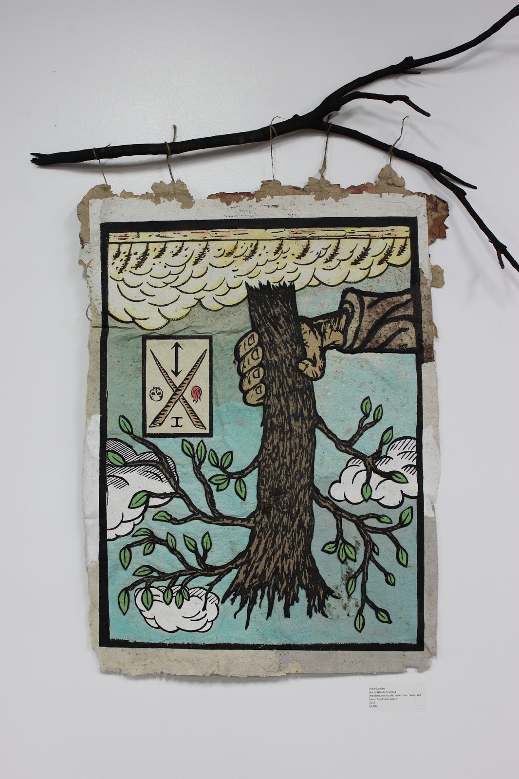
Usen Gandara: Ace of Wands Reversed
Woodcut, chine collé, watercolor, twine, and ink on handmade paper, 2016.

Usen Gandara is a Los Angeles based artist working in Painting, Printmaking and Sculpture. This was actually one of my favorite pieces because of the depth of the tree - it actually protrudes out towards the viewer. The way it was presented, reversed, makes it seem like a gift from the heavens, but if you look at it right side up it's actually a hand holding up what seems to be an uprooted tree. The dead branch that the piece is hanging from also adds another dimension to the piece making it more "real." It's almost as if the branch bridges the artists/viewer gap. More of his art can be found by visiting http://usengandara.blogspot.com/


Sunday, April 24, 2016

Museum of Latin American Art (MOLAA) - LB ZF 2016:


Thank you Ward for the invitation. Great vibes at the Long Beach Zine Fest. It was my first time going to MOLAA. I did check out a few magazines and some artwork. I got to listen to some bands. I look forward to revisiting MOLAA and attending more LB Zine Fests.

Leopoldo Mendez:


Leopoldo Mendez was born on June 30, 1902. He was from Mexico City. He was a political/social activist, a painter, an art instructor, a book designer, and well-known for his "engraving work" (wiki/Leopoldo). His work was in books and magazines. Mendez and his colleges, created political propaganda.

Something very interesting: "In [the] 1940s, he was under arrest for a few days after David Alfaro Siqueiros and his group assaulted Leon Trotsky’s house in Coyoacán, kidnapping and killing his secretary. The reason for this was that the attackers left 'evidence' to frame the Taller de Gráfica Popular. However, Méndez was released with no charges" (wiki/Leopoldo). I found out that Frida Kahlo and Diego Rivera were protecting Trotsky around that time period. Trotsky lived in Kahlo's house for a while. It is stunning to find out that Mendez, Kahlo, and Rivera, had connections with Trotsky.

This piece is my favorite piece for many reasons. The shapes are made out of different lines. The hat looks like it is made out of dried plants. The man's arms look muscular. He looks very serious and ready to fight for something he believes in. I like that the torches' flames stick out more than the other objects. This piece should be read from left to right. The lines and the people's postures, lead us to the right of this piece. It looks like everyone is running. I like that the shadows are made out of compacted lines. I like that, regardless of how chaotic the lines may seem, I can still figure out what is going on in the piece. It looks like it is a dark and windy night. This piece is asymmetrically balanced. The man is the main attraction and the mob takes up some of the background. I believe that this is a three-dimensional piece. The man is the closest object to us. The mob is in the middle and the sky is the background. I like that there is a lot of texture in this piece. I love that this piece displays the social, political, and cultural background of my people. It shows that we are strong, hard-working people. This piece helped me realize that I should never give up and to keep moving forward.

Sources: 

- Sam. Cedillo

Wednesday, March 23, 2016

2015 Printmaking Survey of the Los Angeles River

Alex Fridrich, LA River Path, Copper etching with aquatint


Hello Printmakers,

Christian Ward here to feature this amazing copper etching by Alex Fridrich. I found this work at Self Help Graphics in Boyle Heights. This is one of seven prints in a portfolio trade created in the  Professional Printmaking Program at Self Help. In the summer of 2015 Self Help organized seven printmakers to create an edition with the LA River as its theme. The edition, or portfolio trade was called 2015 Printmaking Survey of the LA River, each artist pulled an edition of thirty prints. The prints were traded amongst each other as well as sold at openings in Boyle Heights and downtown Long Beach.

My favorite print in the trade was by Alex Fridrich: LA River Path, copper etching with aquatint. Fridrich was born in Stockton, California in 1988. She received her BFA in printmaking from Cal State Long Beach in 2011. Fridrich is a local artist and printmaker in Long Beach. She practices a variety of printmaking mediums and loves to explore ideas of place and family history. Alex Fridrich is also co-founder of The Collective print studio, a small printmaking shop and gallery in downtown Long Beach. 

All of the prints in the show were 11" X 15" so I would say these were all medium sized prints. The mark-making and line work in LA River Path  is amazing to explore with my eye as I go from scene to scene in the composition. The aquatint method, a technique that gives the copper plate tonal variation, breaks up the "panoramic" composition nicely. The print is black and white but this is not detracting; the strength seems to be in the variety of grays and contrast between black and white. 

Fridrich seems fascinating by these intimate and surprising encounters she has made during bike rides up the river to downtown Los Angeles. I enjoy the mashed-up composition where scenes along the river exist at the same occurrence. The "panoramic" composition points to the act of remembering. The artist speaks to our organization of space and sense landscape through experience. Scene after scene seems to accumulate into the artists idea of her surroundings.

Cheers,
Christian Ward

Other prints in 2015 Printmaking Survey of the Los Angeles River:

Usen Gandara, The River of Los Angeles with its Plants and Animals, Linoleum relief print, 2015

Poli Marchial, Frogtown, Linocut, woodcut, chine colle and digital print, 2015

Kimiko Miyoshi, Big Gulp at Glendale Narrows, Viscosity collagraph, 2015

Miyo Stevens, Natural History: Los Angeles River, 1938 with Elderberry, Mugwort and Mulefat, 
4-color woodcut

Christian Ward, Up the River from Golden Shore to DTLA, Silkscreen, etching and linocut, 2015

Alvaro D. Marquez, Avenue 60 Bridge, 3-color linoleum cut reduction, 2015